 RSS feed for posts
Google Chart Granularity
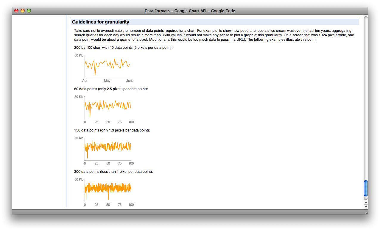
Google provide an API to create pretty graphs and charts. Along with that API, they provide a little information on how granular your data should be, which looks something like this:
Google also own Feedburner, and they provide the pretty (and very, very detailed) graph shown below. Can you see where I’m going with this?
