 RSS feed for posts
Mapping Twitter: Exam & University Results
I’m a big fan of making pretty maps, so when I thought up an idea yesterday morning, I had to see it through. For those who weren’t aware, last Thursday was exam results day for loads of kids all over the country, the day they found out where they’d be going to university. More than a few announced this via Twitter (as you do these days, I guess); and as they were copying and pasting from “the results site”, they were fairly easy to find.
So I stitched together a Google map of the UK, and set to work putting the points on a map; it made sense to do it by hand seeing as the sample size wasn’t massive. And here’s the result (click through for a massive version if you really feel like breaking your browser and my Amazon S3 account):
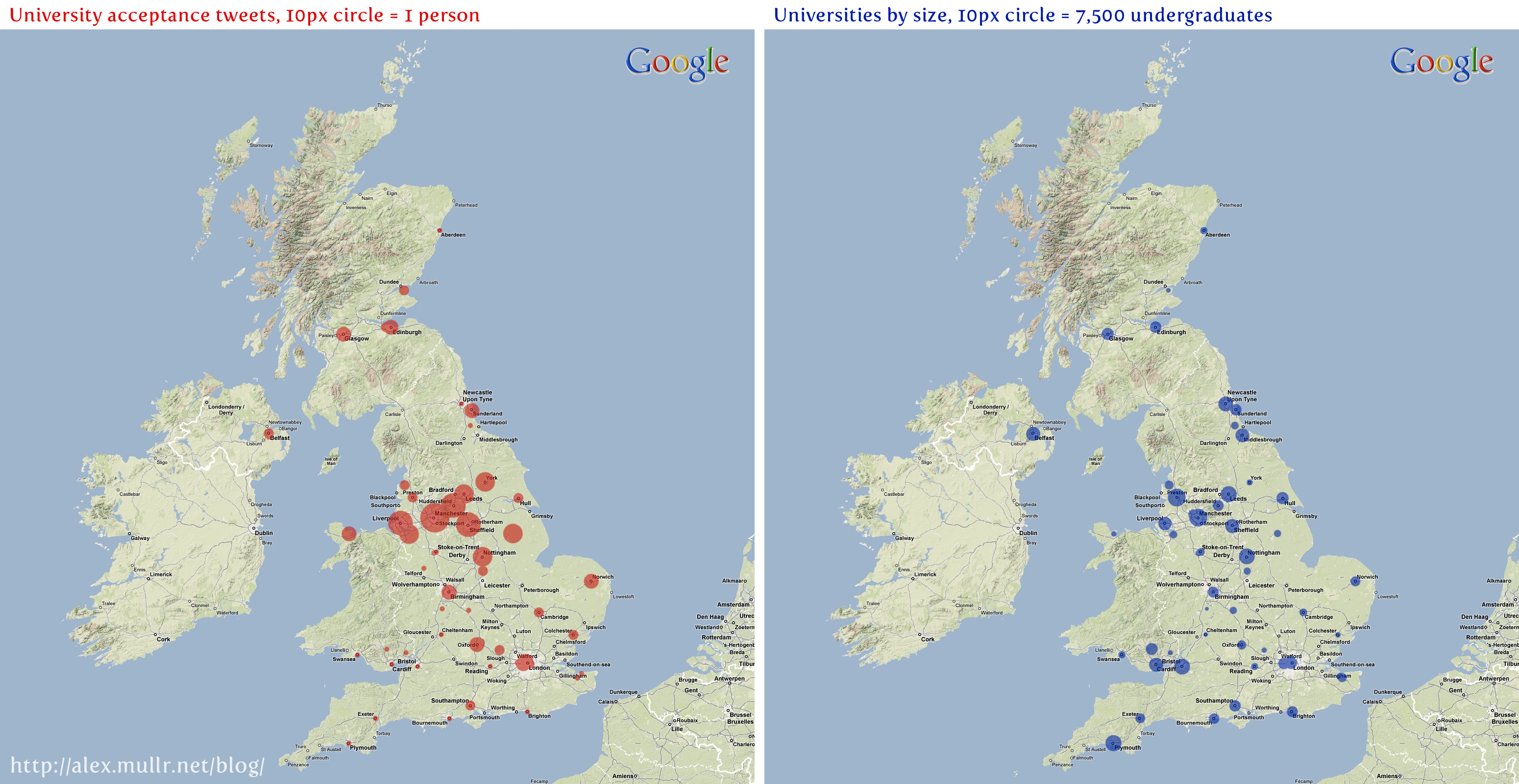
For reference, the blue dots map number of undergraduates against location. Both maps should be scaled sort of properly (there’s the same amount of red as there is blue, if my Maths hasn’t failed me). It was interesting to see how the many more results came from the universities in the middle the country when compared to their size.
And as though that wasn’t enough, I went and made you a Wordle of what subjects people are studying:

Oh, and I don’t claim that any of this is 100% certified guaranteed scientifically accurate™. It was just a fun little project for the day. My messy data’s available as a .csv should you wish to inspect it.
Comments
By Richard Mitchell on 26 August 2009 at 13:33:
I suspect you’ll see a lot of skew towards technical/social/media subjects and universities given the majority of Twitter users are over 20 and the interests of those users who aren’t generally lie in those areas (or spam).
By Richard Mitchell on 26 August 2009 at 13:33:
Given a bigger sample that is.
about this post
From 01AM on Wednesday August 26, 2009
Tagged as: google • googlemaps • mapping • twitter • university