Chromaroma
Chromaroma is a London-based game involving Oyster cards; you link your card up to your account and it pulls data in from TfL’s journey history.
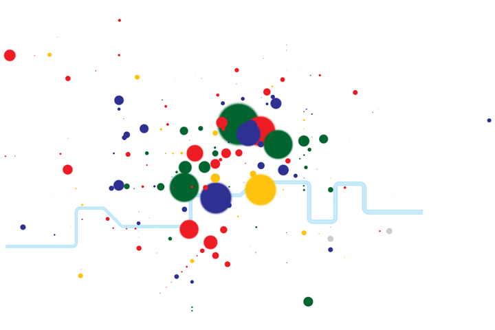
I wanted to be able to see more of the data that Chromaroma has stored up, so I took the stations off the leaderboard (the most visited stations) and plotted them onto TfL’s tube map. The more swipes a station’s had, the larger it appears. Oh, and coloured according to which team currently owns it.
The result?
Yep, it’s just blobs and a river. But hey, they’re pretty blobs. I’d love to see some kind of simple visualisation like this on the site.
Comments
By Richard on 16 November 2010 at 09:39:
Hi Alex,
Really nice going. I particularly like the almost solar system like trail of captures running down the Northern line south of the river.
Take a look at some of the dev photos here: http://www.flickr.com/photos/wearemudlark
We’ve been messing around with different ways to visualise team play in 2d and 3d, but we’re not quite there yet. One difficult thing has been how to represent stations that are ripe for stealing from another team.
My touchstone and Pivotal Tracker story is ‘A user should feel like TRON’.
Nice one.
Richard
By Alex Muller on 28 November 2010 at 10:09:
Hey Richard - great to see those photos there and on your blog, thanks. Really looking forward to seeing where you take things yet - it’s interesting to finally see a game that doesn’t require any additional effort for the user. Shame about the strike tomorrow, though :(
By zethraeus on 06 December 2010 at 19:11:
it looks like google spraypaint :)
Keep doing to visualization projects, they’re fun.
 Tags:
Tags:

