“600 Happy Users”
Last night, my redesign of the internal Maths department VLE at the University of York went live. When I started at the department in October last year, it looked a little like this:
Click the image to view it in all its glory. I’m not going to draw your attention to some of the things I’ve come to love most about it, because frankly it speaks for itself.
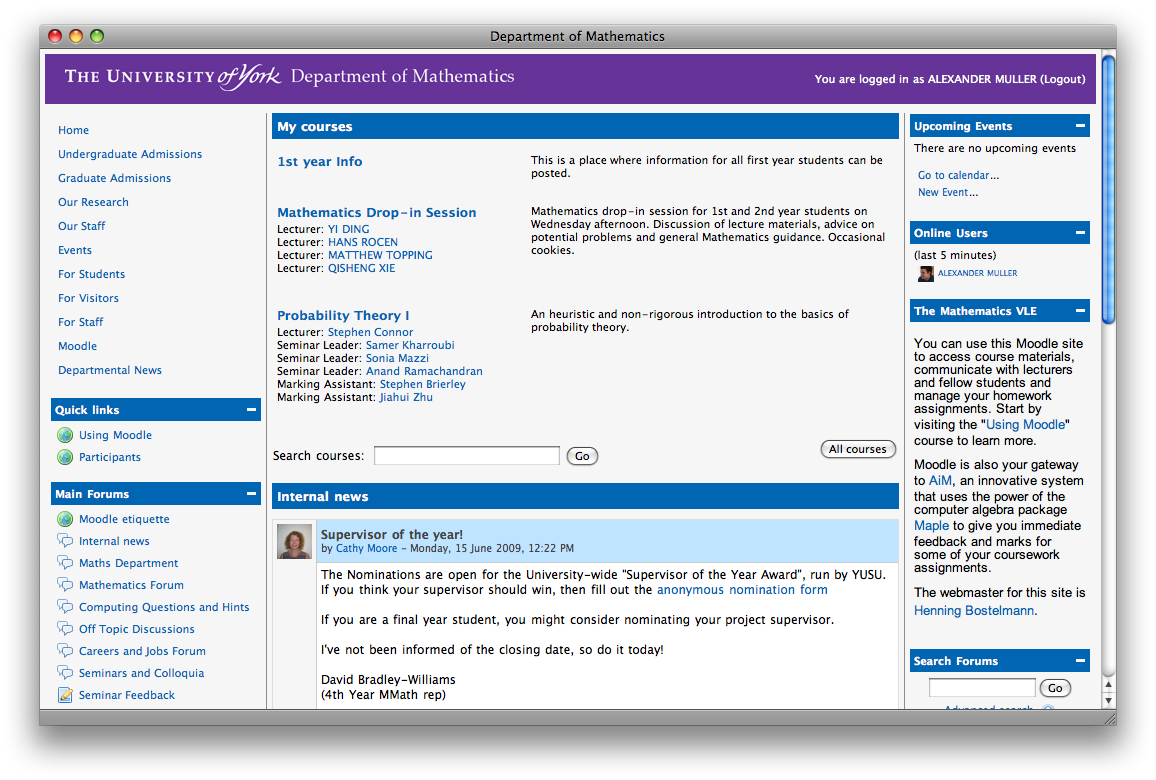
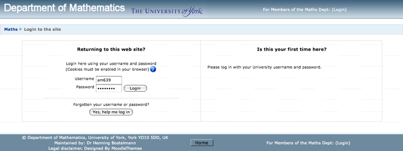
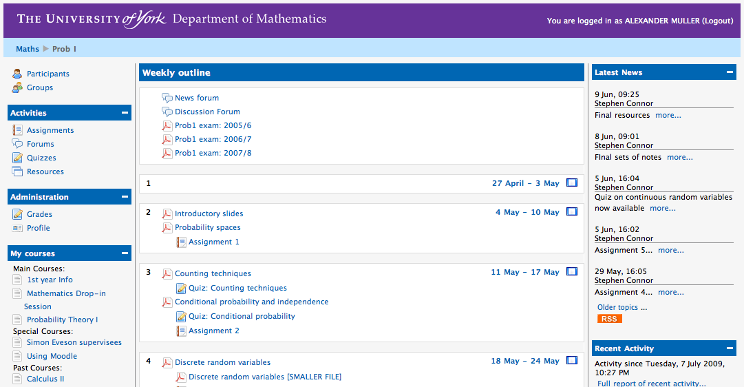
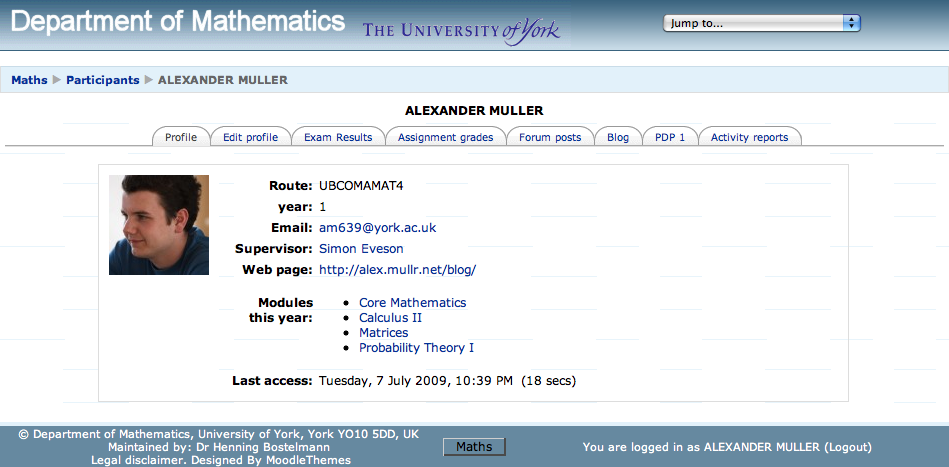
As you might expect, looking at that got boring and started to hurt my eyes pretty quickly. In May, I went to see Henning Bostelmann, the guy who looks after all things Maths & website there, and offered to try my hand at creating something. This is what’s happened over the last couple of months:
Leaving Henning’s office last week, he remarked how there would now be “600 happy users” in the department - thank you, Henning, for your help testing, fixing, testing, updating, and more testing.
I love university; there’s so much freedom to do anything and everything to improve departments, societies, colleges, the list goes on. I hope I don’t sound too much like a naive little first year, but I really do think it’s the case - here’s something which will (hopefully) outlast the time I spend at York, and that means something to me.
The boring interesting stuff: it’s a fairly hacky CSS job (so no
judging my [lack of] coding skills from here, please), using the gorgeous
Silk icons from famfamfam - so
many thanks to Mark James for providing his icons free of charge, they’re such
a great resource. Moodle, the open-source (!!, ♥)
learning environment that we’re using, is actually impressively easy to mess
about with. This seems to be one of those “20% of pages used 80% of the time”
situations, so it’s nowhere near finished and there’s always room for
improvement; might do the same thing again next year to just tidy it up.
What follows are a few parts that I’m really happy with…
 RSS feed for posts


